Role
Lead Product Designer
Design Team
Margaret Freeman, Principal UX Writer
Timeline
Nov 2024 - July 2026
Relationship Benefits is KeyBank's program for rewarding customers as they deepen their relationship with the bank. The goal was to bring the program into the digital banking experience and make its value easier to discover, understand, and act on.
I led the design from strategy and concept development through launch, evaluation, and redesign —working closely with UX strategy, UX writing, product, business, and engineering partners to shape the experience and drive decisions forward.
The Challenge
The MVP came with real constraints: a limited set of benefits, a tight launch timeline, limited personalization, and no opportunity to conduct a proper evaluative study before launch.
The opportunity was to make the most of what we had—creating an experience that felt valuable enough to explore while giving customers a clear understanding of the program.
How might we build excitement around Relationship Benefits, despite having limited benefits to offer our users?
Meeting the brief wasn't enough
When I joined the project, several concepts had already been explored. They were resonating with stakeholders because they addressed the requirements we had been given and established the core functionality needed for launch.


The concepts were doing what they needed to do but my design director and I saw an opportunity to push the experience further.
The functionality was there, but the experience wasn’t yet creating the level of desirability we wanted—especially when the MVP had a limited number of benefits to showcase.

The early concepts felt flat from a UI perspective. There weren’t strong visual elements to create excitement or draw users in, and the experience lacked moments of delight such as micro-interactions or subtle animations. As a result, the program didn’t feel particularly engaging or motivating to explore, especially for something intended to introduce a new benefits experience.
Designing for Desirability
We explored how the experience could make a small set of benefits feel more meaningful without expanding the MVP scope.
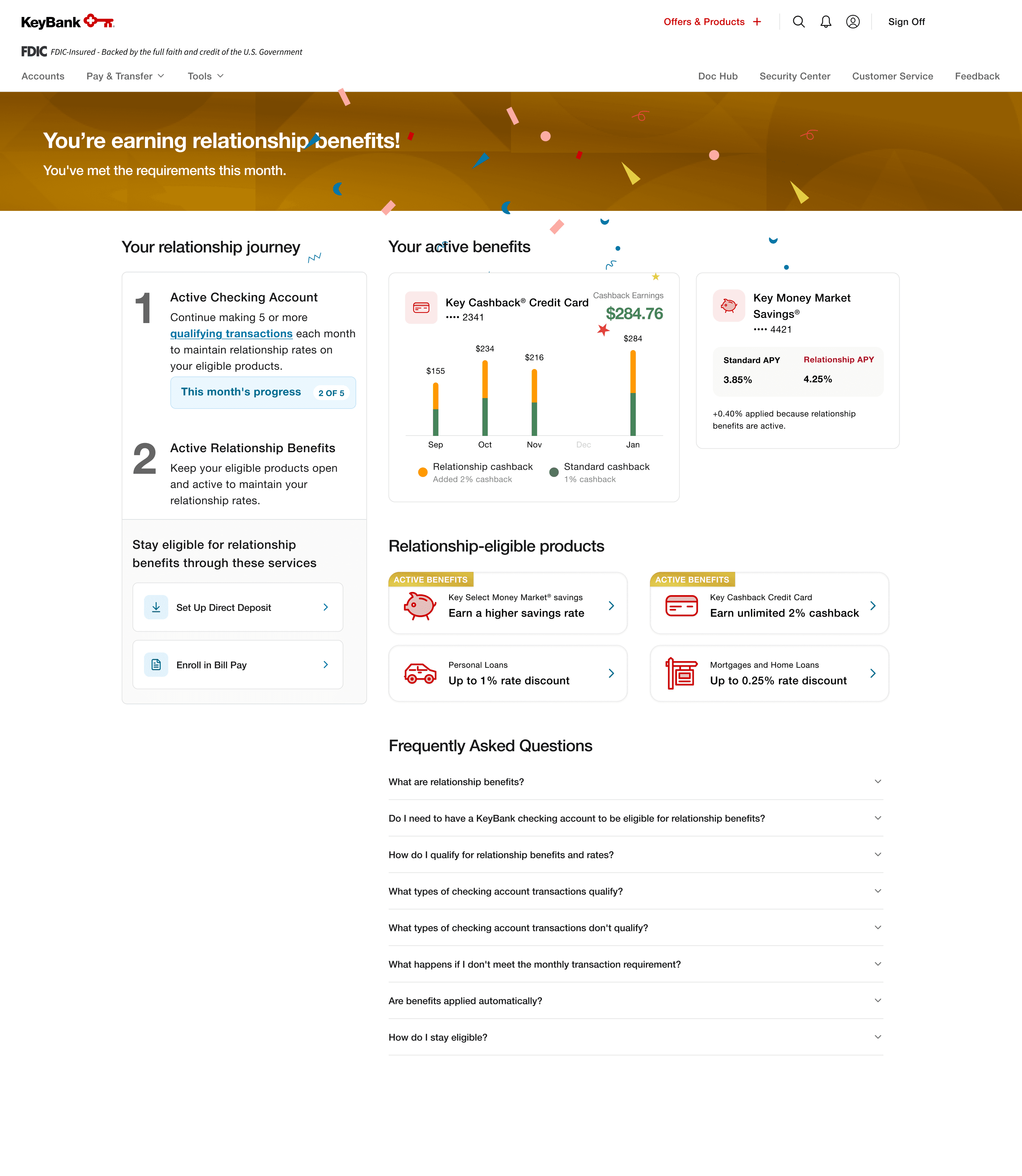
The goal was to preserve the functionality stakeholders needed while giving the program a stronger visual and experiential presence.
We introduced a celebratory confetti screen when users reached the point where they were receiving benefits, and explored visual treatments outside of our existing design system. This included introducing net-new elements that weren’t used elsewhere in the banking app, intentionally making the experience feel more distinct and rewarding compared to standard banking actions.
The MVP
The first release established the core Relationship Benefits journey within the KeyBank mobile app.

The numbers were encouraging
Relationship Benefits launched in early 2025.
Within the first two weeks:
[VISUAL — Metric cards]
389K
Feature views
300K
Unique viewers
2K+
Credit application starts
1.4K
Credit application completions
The experience continued to show strong engagement.
In July, credit application starts reached:
51K
compared with a typical monthly range of 13–16K.
Completions reached:
37.8K
compared with a typical monthly level of 10.77K.
[VISUAL — Before / July comparison]
Make these comparisons visual rather than explaining them in prose.
Going back to what we shipped
We hadn't been able to conduct a proper evaluative study before launch.
Now that the experience was live, I had the opportunity to evaluate it with customers and understand where the design could improve.
We conducted usability testing and survey analysis focused on comprehension, progression, content clarity, product relevance, and trust.
[VISUAL — Research snapshot]
Show your actual research materials if possible.
For example:
USABILITY TESTING
[Participant count]
SURVEY
[Sample size]
FOCUS
Comprehension · Progression · Clarity · Relevance · Trust
[NEED FROM YOU]
I need the actual research details here:
Number of participants
User/customer type
Moderated or unmoderated
Number of survey responses
Testing tasks
Any benchmark score or quantitative result
Any other research methods
What we found
The research surfaced four areas where the experience could work harder for customers.
[VISUAL — Findings grid]
01 — Progression
Customers weren't always sure where they stood.
The relationship between their current level, the next level, and what they needed to do to advance wasn't immediately clear.
[SHOW USER QUOTE / TESTING EVIDENCE]
02 — Cognitive load
Customers were encountering too much repetition.
Repeated information made the experience harder to scan and understand.
[SHOW USER QUOTE / ANNOTATED SCREEN]
03 — Terminology
Some language created unnecessary friction.
Certain terminology felt impersonal or wasn't immediately understood.
[SHOW USER QUOTE / COPY TESTING]
04 — Product relevance
Customers didn't always know what applied to them.
The relationship between their benefits and relevant products could be clearer.
[SHOW USER QUOTE / TESTING EVIDENCE]
[NEED FROM YOU]
This section will become much stronger with actual evidence.
For each finding, send me either:
A user quote
A testing observation
A task failure
A percentage/result
Or even a rough note from your research
I can turn those into concise, portfolio-ready evidence.
From research to design
I translated the research into a focused set of design changes.
[VISUAL — Research → Design decisions]
What we learned | What I changed |
|---|---|
Progression wasn't clear | Made current status and next steps more visible |
Information was repetitive | Consolidated and restructured content |
Terminology created friction | Refined language and microcopy |
Product relevance was unclear | Clarified the connection between benefits and products |
Keep this visual simple.
The detailed evidence comes next.
Design Principles Driving the Redesign
Make progression visible
Customers needed a clearer understanding of where they were and what they could do next.
Reduce cognitive load
We consolidated repeated information and restructured the content hierarchy so customers could understand the essentials quickly and explore more detail when needed.
Make the language more relatable
We refined terminology and microcopy where research showed that language was creating unnecessary friction.
Make product relevance clearer
The redesign also strengthened the connection between Relationship Benefits and relevant products.
A clearer path through Relationship Benefits
[VISUAL — Full-width final experience]
This should be the visual centerpiece of the case study.
Show the final experience as one connected journey:
Account
→
Relationship overview
→
Current level
→
Benefits
→
Next level
→
Relevant products
Give these screens room to breathe.
Use only a few annotations to point out the most meaningful changes.
The evolution
[VISUAL — Phase 1 vs. Phase 2]
Show the same key screens side by side.
PHASE 1
[Screen]
PHASE 2
[Screen]
Then three concise callouts:
Clearer progression
Less cognitive load
More relevant action
This lets the hiring manager see the transformation without needing a long explanation.
Relationship Benefits reinforced the value of staying close to a product after launch. The MVP showed that customers were interested in the program. The research that followed showed us where engagement didn't necessarily translate into understanding.
That distinction shaped the second phase of the work. I had the opportunity to revisit something we'd already shipped, challenge where it could be better, and use customer evidence to guide the next iteration. The redesign shifted the experience toward helping customers understand their relationship with the program: where they are, what they've earned, and what they can do next.
For me, that's where the most valuable design work happened—taking what we learned from the first version and using it to make the next version meaningfully better.
