Content
Role
Lead Product Designer
Design Team
Margaret Freeman, Principal UX Writer
Josh Lee, Principal Designer
Timeline
Nov 2024 - Aug 2026

Relationship Benefits is KeyBank's program for rewarding customers as they deepen their relationship with the bank. The goal was to bring the program into the digital banking experience and make its value easier to discover, understand, and act on.
I led the design from strategy and concept development through launch, evaluation, and redesign —working closely with UX strategy, UX writing, product, business, and engineering partners to shape the experience and drive decisions forward.
The Challenge
The MVP came with real constraints: a limited set of benefits, a tight launch timeline, limited personalization, and no opportunity to conduct a proper evaluative study before launch.
The opportunity was to make the most of what we had, creating an experience that felt valuable enough to explore while giving customers a clear understanding of the program.
How might we build excitement around Relationship Benefits, despite having limited benefits to offer our users?
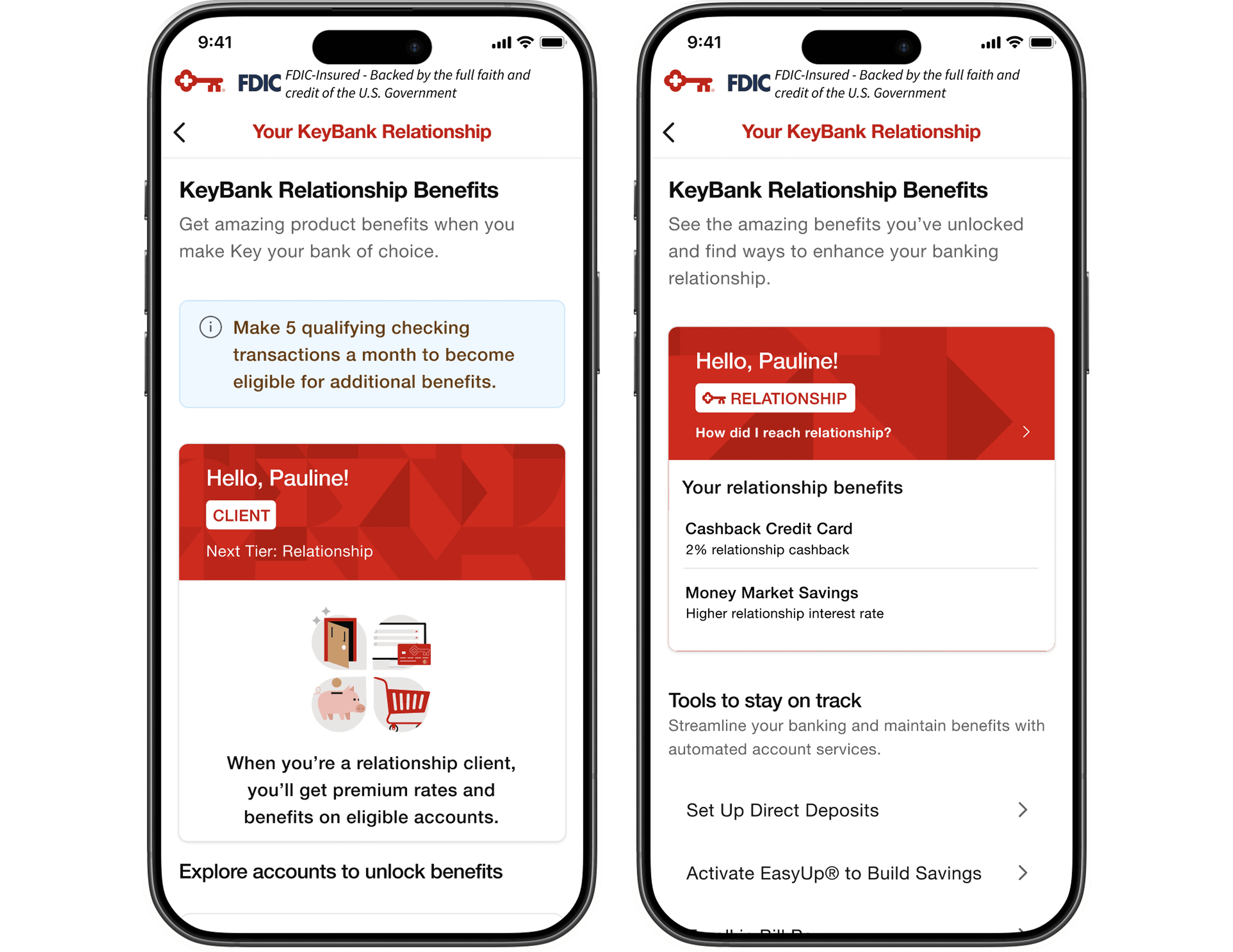
Iteration 1
Iteration 1 felt flat from a UI perspective. There weren’t strong visual elements to create excitement or draw users in, and the experience lacked moments of delight such as micro-interactions or subtle animations. As a result, the program didn’t feel particularly engaging or motivating to explore, especially for something intended to introduce a new benefits experience.
Why desirability, and not just usability, was the right problem to solve
[FILL IN: What told you this was a desirability problem specifically, not a comprehension or usability one? Was it a competitive read of other loyalty/benefits programs? A stakeholder observation? Your own reaction to Iteration 1? Even 2-3 sentences of reasoning here turns this from "I decided" into "here's the evidence that led me there."]
Designing for Desirability
I explored how the experience could make a small set of benefits feel more meaningful without expanding the MVP scope. The goal was to preserve the functionality stakeholders needed while giving the program a stronger visual and experiential presence.
lorem ipslum, talk about how a product doesnt need to be just usable but it has to be desirable, this is a first time digital intro to this program, we want users to interact with it.
Relationship Benefits launched in early 2025.
The MVP served customers across three relationship states: Non-Checking, Client, and Relationship Client.
Within the Client experience, both non-checking and checking customers saw largely the same information—including the requirement to make five qualifying checking transactions—even though their paths toward Relationship were different.
That created an opportunity to make the experience more relevant to where each customer actually was in their journey.
For customers who reached Relationship status, I wanted the experience to recognize the milestone. I introduced a celebratory confetti animation to mark the moment they became eligible for Relationship benefits, turning a status change into a small moment of delight.

Within the first two weeks:
389k
feature views
300k
2k+
credit application starts
1.4k
credit card application completions
Engagement continued to climb. In July, credit application starts reached 51K, compared with a typical monthly range of 13–16K. Completions reached 37.8K, compared with a typical monthly level of 10.77K.
Going back to what we shipped
We hadn't been able to conduct a proper evaluative study before launch. Now that the experience was live, I had the opportunity to evaluate it with clients and understand where the design could improve.
We conducted usability testing and survey analysis focused on comprehension, progression, content clarity, product relevance, and trust.
What we found
01 — Progression
Clients weren't always sure where they stood. The relationship between their current level, the next level, and what they needed to do to advance wasn't immediately clear.
"I’m a little unclear specifically how to go from client to relationship status"
02 — Cognitive load
Clients encountered too much repetition. Repeated information made the experience harder to scan and understand.
"You explained what you get from the relationship tier but how to unlock that appears in a different section so I think you just need that needs to be clearer"

03 — Terminology
Some language created unnecessary friction. Certain terms felt impersonal or weren't immediately understood.

The research revealed that status was doing too much of the work in the MVP. Labels like “Client” and “Relationship” described where a customer sat within the program, but they didn't necessarily help customers understand what that meant for them.
I focused the redesign around four principles: make progression visible, show what's actionable now, reduce cognitive load, and make benefits feel relevant.
Each change was designed around a simple question: What does this customer need to understand or do at this point in their journey?
01 — Shift from status to journey
In the MVP, “Client” and “Relationship” were prominent labels. But a status alone doesn't tell a customer what they can do or what they've earned.
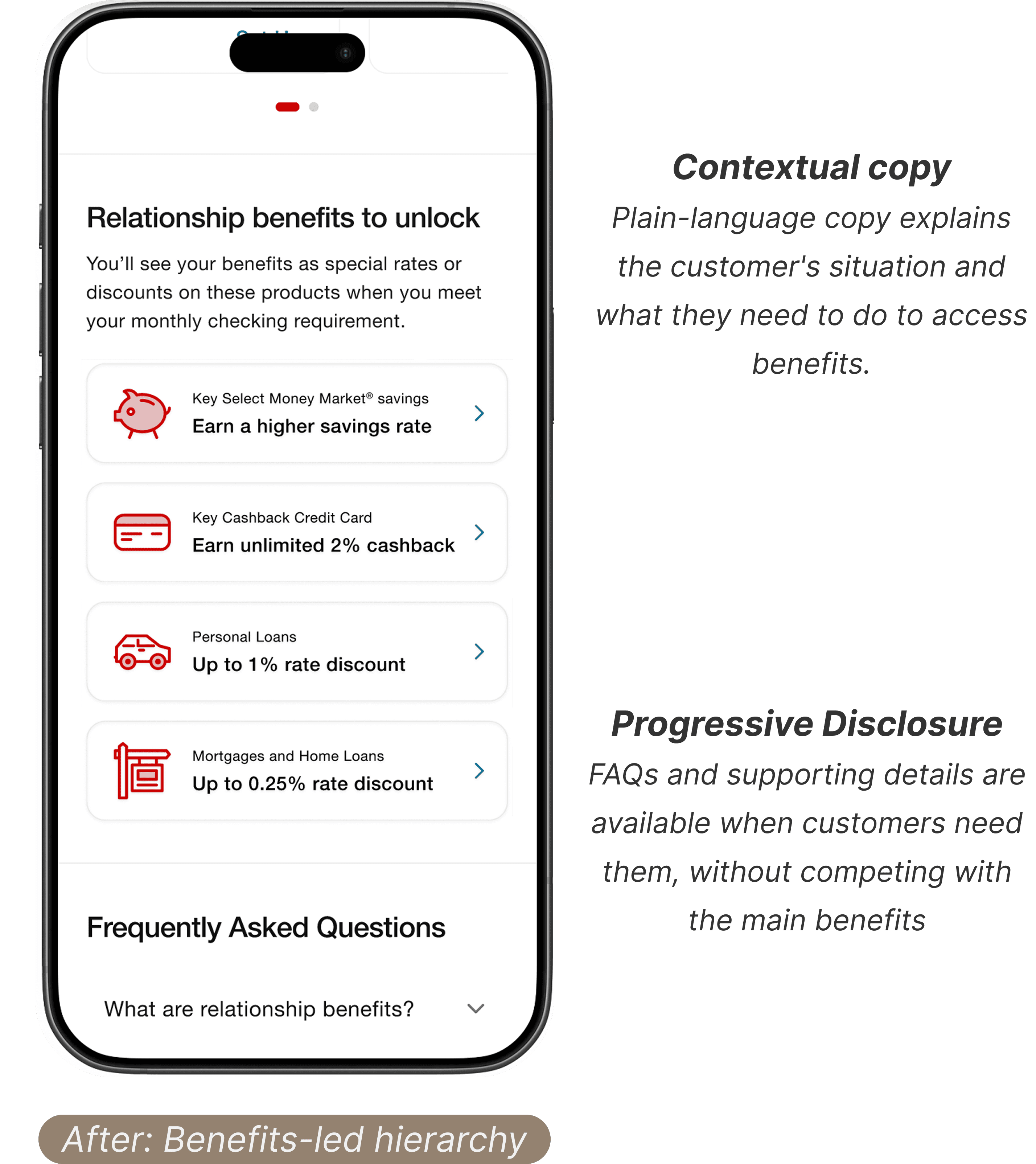
I removed those labels and used plain-language copy to communicate the customer's situation directly.
02 — Show what's actionable now
Reveal information as it becomes relevant. Not every Client was at the same point in the journey. This use of progressive disclosure reduced unnecessary information upfront while keeping the path toward Relationship clear.
For customers without a checking account, the five-transaction requirement wasn't actionable yet. I redesigned this experience to focus on the next step they could actually take: opening a checking account.

03 — Put benefits at the center
With status removed, the benefits themselves became the primary way customers could understand the value of their relationship with KeyBank. The redesign gives greater prominence to what customers are eligible for or already receiving, rather than asking them to first interpret a program tier.
04 — Reduce cognitive load
Testing also revealed that the experience contained repeated information that made the page harder to scan.
I restructured the content hierarchy and consolidated repetitive details so customers could quickly understand the essentials while still having access to additional information when they wanted it.
05 — Create moments of delight
The program is fundamentally about progress. When a customer reaches the point where they can access Relationship Benefits, it's a meaningful milestone.
Preparing the redesign for development
Phase 2 is currently in validation.
I'm testing the redesigned experience with internal teammates to pressure-test the hierarchy, usability, and overall flow before it moves into development. These sessions are helping us identify any remaining friction and refine the experience while there is still room to iterate.
In parallel, I'm working with Product and Line of Business partners to align on the redesign and secure a place on the product roadmap, with development targeted for Q4 2026.
This project reinforced the value of staying close to a product after launch. The MVP showed that customers were interested in the program. The research that followed showed us where engagement didn't necessarily translate into understanding.
That distinction shaped the second phase of the work. I had the opportunity to revisit something we'd already shipped, challenge where it could be better, and use customer evidence to guide the next iteration.
