Content

Offers and Products is KeyBank's mobile hub for surfacing personalized offers — credit cards, loans, mortgages — to clients. It replaced scattered messaging tiles on the account summary page with a single, centralized destination.
But centralizing the entry point didn't fix the experience. Selecting an offer or product often sent clients out of the mobile experience and into Key.com. Usability feedback surfaced a consistent pattern: Slow load times, unfamiliar transitions, and a lack of continuity created friction at the moment when clients were closest to taking action.
I led the redesign of this end-to-end flow, from initial research through high-fidelity mocks, with the goal of keeping clients in-app and moving them toward completion instead of losing them at the handoff.
The opportunity
Create a product-shopping experience that feels native to the mobile app—from discovery and comparison through the decision to apply.
How might we reduce friction from redirects and load times to create a faster, smoother Offers & Products experience that keeps clients engaged and drives higher conversion?
Business goals were straightforward:
Increase conversion
Increase completion
Reduce bounce/drop-off
Improve perceived performance
I ran a broad survey to understand what factors clients weigh when evaluating financial products generally, followed by three product-specific surveys focused on checking accounts, savings accounts, and credit cards individually. The goal was to build an evidence-based information hierarchy — what to show first, what to surface on demand, and what to leave out.
What we found:
[INSERT SURVEY FINDING — general product attributes]
[INSERT SURVEY FINDING — credit card attributes]
[INSERT SURVEY FINDING — checking/savings attributes]
📈 VISUAL — Ranked attribute chart (e.g. a simple bar chart showing which attributes clients ranked highest per product type — this replaces a lot of explanatory text)
These findings directly shaped the information hierarchy in every concept that followed.
Based on the research, I explored two ways of structuring product information: how much to show up front, how much to reveal on demand, and how clients would move between products while comparing them.
One open question was how much visual priority to give a product's standout attributes versus letting all features read at equal weight. I explored two tile treatments to test this directly:
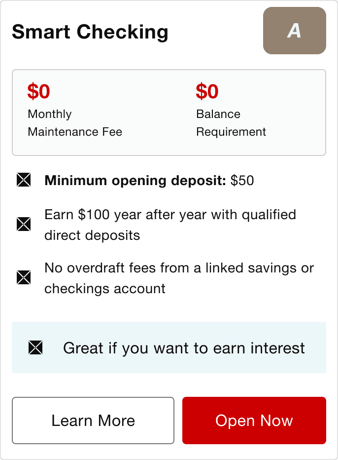

Card A: Highlight-first pulls 1-2 standout attributes ranked most important in the earlier attributes survey — here, $0 monthly fee and $0 balance requirement — into a separate stat block above the feature list, giving them visual priority before the reader reaches any other detail.
Card B: Feature-first presents the same content as a flat, equally-weighted list of features, with no attribute called out above the rest.
Testing result
The feature-first card performed better — the opposite of what I expected going in. Participants found Highlight-first card's attribute block added a second layer of information to scan rather than simplifying the decision. When comparing multiple cards side by side, they lost track of what they'd already seen and struggled to know where to look first. The flat, single-weight list in Version B was easier to scan repeatedly across cards, even though it surfaced the same content with less visual emphasis.
This was a useful correction: ranking attributes by importance in a survey doesn't necessarily mean visually emphasizing them helps at the tile level — especially in a comparison context, where consistency across cards matters more than emphasis within one card.
Refined Product Card

The tagline moved to the top. The issue wasn't emphasis, it was sequencing — reading features first and "why this one" last meant clients had to figure out the differentiation themselves.
Fees and balance requirements stayed as a consistent callout on every checking product, since that was the top priority from earlier survey findings.
"Open Now" was removed — not a research change, but a compliance requirement that clients see full disclosures before opening an account, so the tile CTA became "See Details" only.
I ran an unmoderated usability test comparing two interaction models:
Design A — Vertical scrolling with a "See details" tap-through
Design B — Horizontal scrolling with a dynamic information panel
Participants completed three realistic shopping tasks:
I ran an unmoderated usability test comparing two interaction models:
Design A — Vertical scrolling with a "See details" tap-through
Design B — Horizontal scrolling with a dynamic information panel
Participants completed three realistic shopping tasks:
I ran an unmoderated usability test comparing two interaction models:
Design A — Vertical scrolling with a "See details" tap-through
Design B — Horizontal scrolling with a dynamic information panel
Participants completed three realistic shopping tasks:
This project changed how I think about onboarding. I initially saw onboarding as a set of tasks that needed to be completed. Through the redesign, I came to see it more as a guided relationship-building moment: the product has an opportunity to establish confidence, help clients understand what matters, and make the next action feel obvious.
The strongest improvements weren't necessarily the biggest visual changes. They came from questioning where clients were being asked to make decisions or do work that the experience could simplify for them.
